Get on Deck with Slides
Would you like to know the most important question about using a slide deck in a speech? That question is:
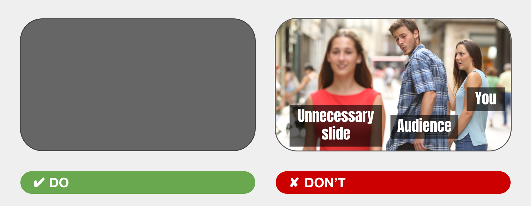
Do you need slides?
I know we’re talking about how to use slides, but the first consideration when choosing any public speaking tool is: does it benefit the speech? Slides have always been tempting—but also logistically tricky—to use. So when Toastmasters clubs went remote in 2020, I saw many speakers use slides because finally, it was easy (just press the share-screen button)! Also, many Toastmasters wanted to get better at using slides for presentations at work.
But I also noticed another trend: about two thirds of these speeches were just OK with slides, or actually…worse with slides! Speakers were also missing out on opportunities to explore skills like wordsmithing, emoting, and gestures.
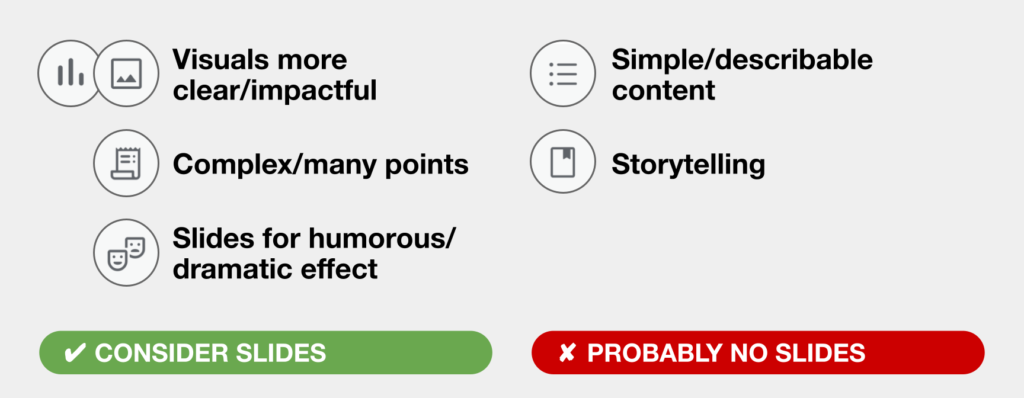
So how do we avoid this mismatch in public speaking tools? How do we know when slides will improve a speech? There’s many reasons, but here are some common ones:
- You have data and images that more clearly, impactfully, or efficiently convey information than spoken words can.
- Your speech covers complex points, or many points. Showing lists and key points while you speak can help audiences remember longer sets of information or calls to action.
- You want to use visual content for humorous or dramatic effect—to contrast with or complement your spoken content. (We’ll expand on this later on!)
Conversely, here are scenarios when a speech might be better without slides:
- Speeches with simple or describable content. A simple speech is often better as just spoken content, where the audience can focus on you and your message. Plenty of TED Talks use no slides!
- Storytelling is another content type that can be better without slides. The reason is, audiences want enough details to relive or imagine the story, but pictures and images can give too much specificity, making it more difficult for audiences to imagine or see themselves in your message.
Alright, if the answer to the question “Do you need slides?” is a resounding “YES!”, here are six tips any speaker can use to create a more effective slide deck:
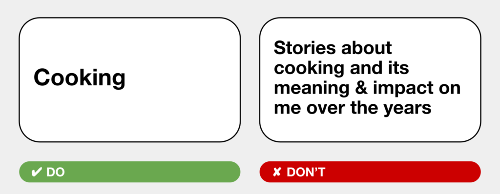
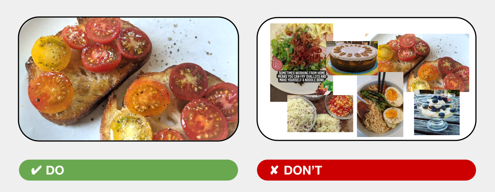
TIP #1. Less is more [per slide]
If there’s just one tip you remember from this list, make it this one: less is more. Keep it to one concept per slide and use the minimum text and imagery that’s needed to support your message.
The reason is, more content not only takes effort and time to read, it takes focus away from you and what you’re saying. Single sentences—sometimes single words—are often all you need. The same goes for images. If you need to show multiple images, show one per slide and simply have them fill the entire slide when possible.
And the great thing is, you don’t need to be a graphic designer to place a single image or a single sentence on a slide. But I guarantee that your slides will look polished!
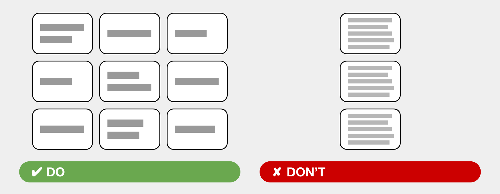
TIP #1.1: More is totally OK [for total slide count]
The counterpart to “less is more” per slide is you may end up with more slides. LOTS more slides. Don’t be afraid! More slides are always better than more content crammed into fewer slides:
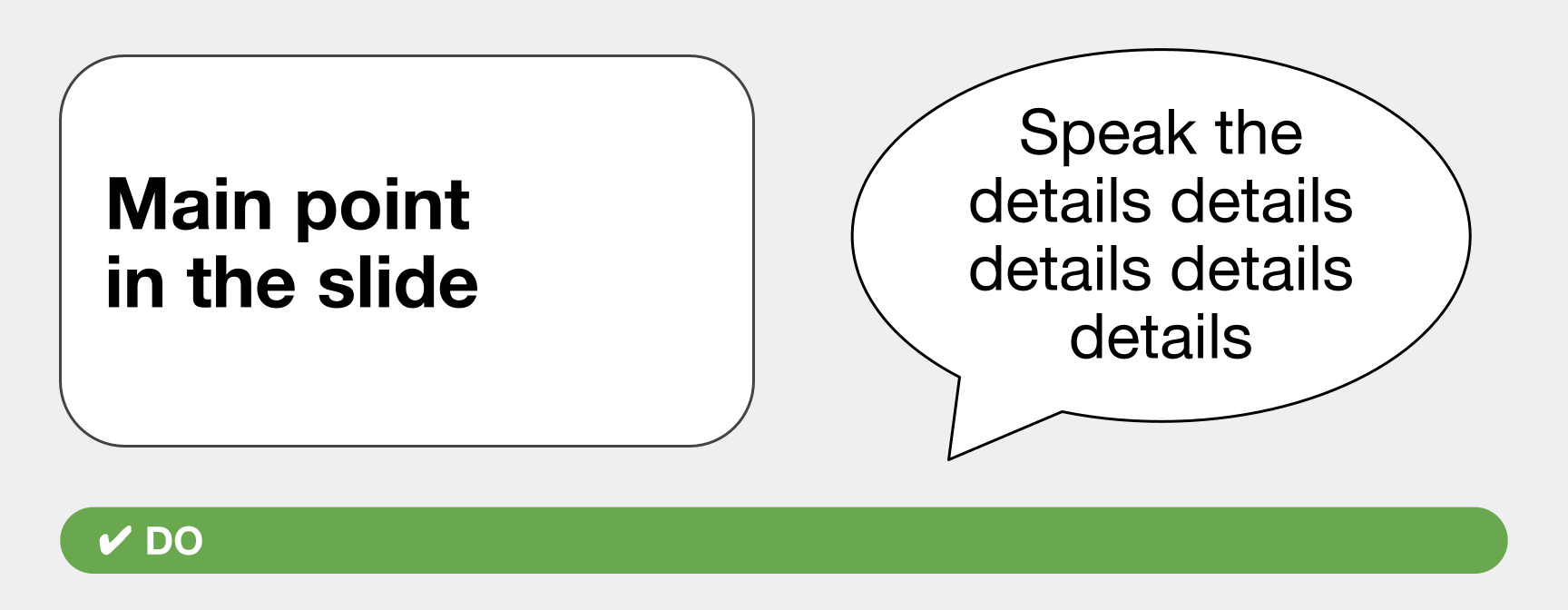
TIP #2: Slides are not a teleprompter
Because slides work best when they illustrate, supplement, or remind the audience about your key points, they don’t create a compelling presentation if you’re just reading from them.
General rule of thumb: show just the main point in the slide, and speak the details:
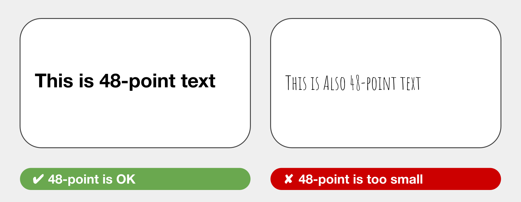
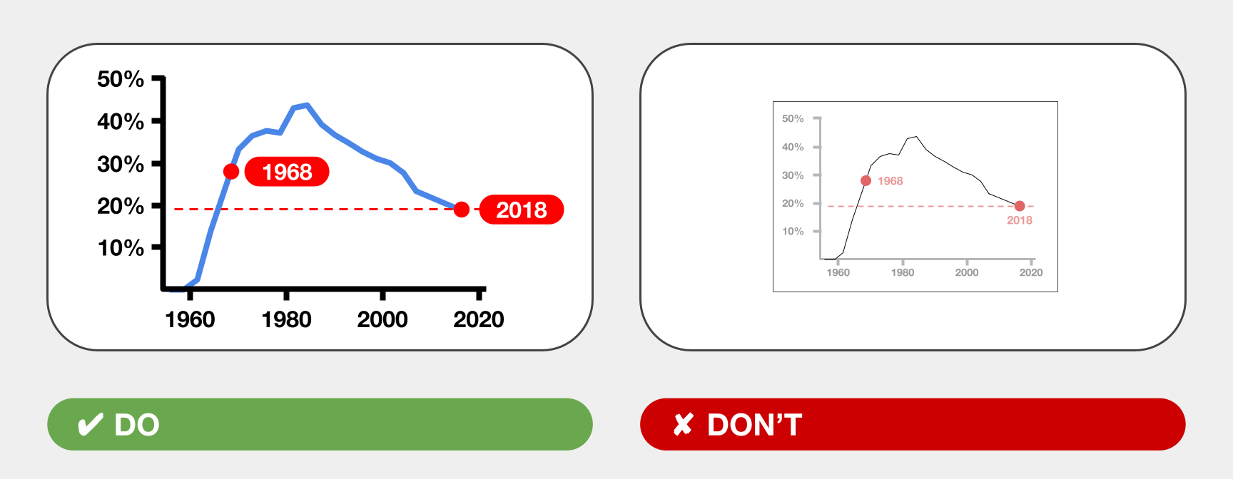
TIP #3. Don’t make people squint
One of the top pain points for slides is ensuring legibility. Use the following guidelines for text sizes and images:
- For hybrid and in-person meetings: use 24-point and larger text
- NOTE: treat this as your smallest size for things like longer lists or quoted text
- For single words or sentences, try 48 points and larger
- For an all-remote meeting: 16-point text can be legible because the audience will see your slides on a screen that’s right in front of them.
- But there’s a caveat: folks joining the video chat from a phone have the worst conditions. It’s up to you how critical it is to accommodate these viewers.
- TIP: You can share a link to your slide deck so audience members can read the content at their leisure.
- Keep in mind: these are starting point guidelines. Not all typefaces are created equal, so 48-point text in one typeface vs. another may be too small or too large. TVs and projectors come in different screen sizes. These guidelines will get you close to what you need, but you should always test your presentation ahead of time.
- Lastly, check your visuals and charts too. Make sure the imagery and text are large enough, the contrast is strong enough, and the lines are thick enough to be legible.
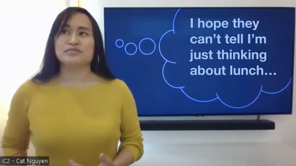
TIP #4: Consider using contrasting or complementary content
This is a bit of an advanced tactic, where instead of using directly supporting visuals, use slides to conflict with or complement your spoken content. You can create humorous or hard-hitting contrasts which aren’t possible with a spoken-only speech.
I once used a thought bubble graphic for humorous effect:
And for a serious example, Linda-Marie Miller, the second-place winner of the World Championship of Public Speaking in 2020, used text that conflicted with the words she spoke. In the example below, Miller said, “I have never used a racial slur or told a racial joke in my entire life!” and then held up a card that read, “I stayed silent when other people did.” That text silently told us the unspoken side of reality, and the result was much more powerful than simply describing the story.

My guideline here is to remember this approach is available to you, and don’t hesitate to get creative!
TIP #5: Use blank slides
Your slides are a partner—sometimes a competing partner—to you and your spoken content. If your speech has sections where no slide is needed, transition to a dark or blank slide. Blank slides move the focus back to you, because whenever slide content is visible, people will unconsciously focus on that instead of you!
FANCY TIP: your slide editor (Powerpoint, Keynote, Google Slides, etc.), will have transition settings for each slide. Use a dissolve/fade transition for the blank slides, so you don’t have a jarring hard-switch. The audience won’t even know they’re putting their focus back on you!
TIP #6: Test it and always have fallbacks
The law of using audio-visual technology is that something almost always goes wrong: The TV or projector is broken. Your cable isn’t long enough. The Wi-Fi is too slow at the location… Testing and fallbacks have saved me from many a failed presentation.
First, test as closely to the real conditions as you can:
- Test the legibility of your slides, from the distances or conditions under which your audience will experience them
- Arrive early and test your setup
- If possible, test during the same time of day
- I once presented slides on a TV behind me, and WOW, presenting at 9am vs. 7pm was a massive difference. I learned I had to turn the TV’s brightness nearly all the way down for daytime presentations.
- Lastly, test with a real audience when possible
- People may not read as fast as you do…
…maybe an image choice is too obscure for your audience to recognize
…maybe the text size isn’t working for older viewers. - Testing with real people before speech day gives you time to make critical adjustments
- People may not read as fast as you do…
After you test, you’ll know which fallbacks you need.
Some of my go-tos are:
-
- Bringing longer cables or extra adapters
- Asking a colleague to bring their laptop and equipment as a backup
- Going analog and bringing printouts: people can follow along with slides in front of them
- Being ready to present without slides. You might need to lightly describe content where necessary. Maybe try a rehearsal without slides!
In short, test under similar conditions, prepare the best you can, and be ready to improvise!
OK I know I said six tips, but I have just one more—
TIP #7: Learn as you go!
Do use these tips to start; they’ll ensure legibility, effective content choices, and a smooth presentation. But I wouldn’t be surprised if you encounter a situation where a different approach is better!
So like all speech-making, practice, feedback, and experimentation with slides will take you far. And in no time, I’m sure you’ll all be on deck with slides!

Written by: Cat Nguyen CC – District 101- Club #04528013 Mountain View Toastmasters